In today's digital world, a website is like the face of your business online. It's where people first meet your brand, so it needs to look good and work well. This article will show you how to design websites that are both beautiful and easy to use. We'll cover the basics of design, the power of colours, the importance of fonts, and much more. Let's dive in and learn how to create amazing websites!
Key Takeaways
- Effective website design is about more than just looks; it also needs to work well for users.
- Choosing the right colours can change how people feel when they visit your site.
- Fonts are important for making your website easy to read and accessible to everyone.
- Your website should work well on all devices, from computers to smartphones.
- Interactive elements like animations can make your site more engaging for visitors.
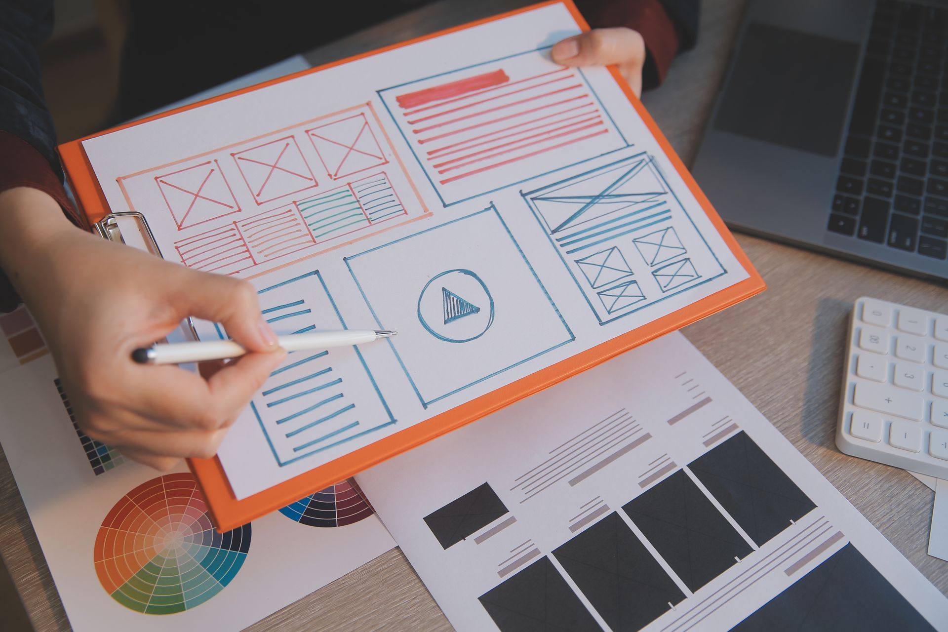
The Foundations of Effective Website Design
Understanding User Experience (UX)
User Experience (UX) is all about making websites easy and fun to use. A good UX design helps users find what they need quickly and keeps them happy. By knowing what users like and need, designers can make websites that people enjoy using
.
The Role of Visual Hierarchy
Visual hierarchy is like a map that guides users through a website. It uses things like size, colour, and placement to show what is most important. This helps users know where to look first and makes the website easier to understand.
Balancing Aesthetics and Functionality
A great website looks good and works well. It's important to balance how a website looks with how it works. This means using nice colours and fonts but also making sure everything is easy to use. When done right, this balance can make users want to stay longer and explore more.
Effective website design is about creating a space that is both beautiful and useful. When users enjoy their time on a site, they are more likely to come back.
The Power of Colour in Web Design
Choosing the Right Colour Palette
Selecting the right colour palette is crucial for any website. Colours can evoke emotions and set the tone for your site. A well-chosen palette aligns with your brand’s message and appeals to your target audience. Consider using a primary colour, a secondary colour, and an accent colour to create a balanced look.
Psychological Impact of Colours
Colours have a psychological impact on users. For example, blue often evokes feelings of trust and calm, while red can create a sense of urgency. Understanding these effects can help you guide users' actions and enhance their experience on your site.
Implementing Colour Theory
Colour theory involves understanding how colours interact with each other. Using complementary colours can make elements stand out, while analogous colours can create a harmonious look. Implementing these principles can make your website more visually appealing and effective.
Typography: The Voice of Your Website
Selecting the Perfect Fonts
Fonts are more than just letters; they represent your brand's personality. From modern sans-serifs to classic serifs, the right typography can make your website both readable and appealing. Choosing the right fonts is crucial for conveying your brand's message effectively.
Readability and Accessibility
Typography affects how easily users can read and understand your content. It's important to select fonts and sizes that are easy on the eyes. Additionally, ensuring your text is accessible to all users, including those with visual impairments, is essential.
Typography Trends in Web Design
Staying updated with the latest typography trends can give your website a fresh and modern look. Whether it's bold headlines or elegant body text, keeping up with trends helps maintain a visually appealing and engaging site.
Responsive Design: Adapting to Every Device
In today's digital world, websites must look good and work well on all devices. Responsive design makes sure that websites adjust to different screen sizes, from big desktop monitors to small smartphone screens. This way, users have a great experience no matter what device they use.
Interactive Elements and User Engagement
Incorporating Animations and Transitions
Animations and transitions can make a website feel more dynamic and engaging. Interactive elements like quizzes, polls, and clickable infographics engage readers by offering a more participatory experience. Use animations to guide users' attention to important areas and transitions to create a smooth flow between different sections of your site.
The Importance of Call-to-Action Buttons
Call-to-Action (CTA) buttons are crucial for driving user interaction. Design CTAs that stand out and encourage interaction. Use compelling language and design to prompt users to take desired actions. For example:
- Sign Up Now
- Learn More
- Get Started
Enhancing User Interaction with Micro-Interactions
Micro-interactions are subtle animations that provide feedback to users. They can communicate state changes, acknowledge user input, or guide users through the interface. Examples include:
- Button animations when clicked
- Hover effects on images
- Real-time form validation
Micro-interactions can significantly enhance the user experience by making the interface feel more responsive and intuitive.
Future Trends in Website Design
Embracing Minimalism
In a world filled with information, minimalist web design stands out. By using lots of whitespace and simple layouts, websites can look clean and professional. This approach helps users focus on the most important content without feeling overwhelmed.
The Rise of Dark Mode
Dark mode is becoming more popular. It reduces eye strain and can make websites look sleek and modern. Many users now prefer dark mode, especially when browsing at night.
SEO and Performance Optimisation
Improving Load Times
A fast-loading website is crucial for keeping visitors engaged. Slow pages can drive users away and hurt your search engine rankings. To improve load times, consider the following steps:
- Optimise images by compressing them without losing quality.
- Minimise the use of heavy scripts and plugins.
- Use a Content Delivery Network (CDN) to distribute your content more efficiently.
- Enable browser caching to speed up repeat visits.
SEO Best Practises
Search Engine Optimisation (SEO) is essential for making your website discoverable. Here are some best practises:
- Use relevant keywords in your content and meta tags.
- Ensure your site is mobile-friendly.
- Create high-quality, original content that provides value to your audience.
- Use internal and external links to improve site navigation and authority.
Learn how to optimise your website design for SEO, mobile responsiveness, and page load speed.
The Role of Mobile Optimisation
With more people using mobile devices to browse the internet, mobile optimisation is more important than ever. A mobile-friendly site not only improves user experience but also boosts your SEO. Key points to consider include:
- Use responsive design to ensure your site looks good on all devices.
- Simplify navigation for smaller screens.
- Optimise touch elements like buttons and links for easy use on mobile devices.
Conclusion
In the end, designing a website is like creating a piece of art. It's a mix of creativity and smart thinking. A good website doesn't just look nice; it also works well and is easy to use. As technology keeps changing, web design will keep growing and getting better. Whether it's for a business, a shop, or a personal blog, a well-designed website can make a big difference. It can help people understand your brand, connect with your audience, and make visitors want to come back.
So, as you start your web design journey, remember that every detail matters. Your website can be a powerful tool to share your message and make a lasting impression in the digital world.
Frequently Asked Questions
Why is user experience (UX) important in web design?
User experience (UX) is crucial because it focuses on how visitors interact with your site. A good UX ensures that users can find what they need easily, making them more likely to stay longer and return.
How do colours affect web design?
Colours can influence how visitors feel and behave on your site. Choosing the right colour palette can set the mood, highlight important information, and make your website more engaging.
What is responsive design?
Responsive design means creating websites that work well on all devices, from desktops to smartphones. This ensures that users have a good experience no matter what device they are using.
Why is typography important in web design?
Typography affects readability and the overall look of your website. The right fonts can make your content easier to read and help convey your brand's personality.
What are common mistakes to avoid in web design?
Common mistakes include cluttered layouts, slow load times, and poor mobile optimisation. These issues can frustrate users and make them leave your site.
Best
Marcus Johnson - Urbandog Media

Getting Noticed Online


